June 30 2026
The Curious Case of Liquid Glass in the 2027 Releases
Two years ago, I wrote about the new tab design in iPadOS 18. Today, I'm back with another look at Apple's evolving design language.
The 2027 releases bring a number of refinements to Liquid Glass. Apple introduced a Liquid Glass strength slider, removed the floating sidebars, made top bars opaque again, and got rid of the gradient layer behind toolbars and tab bars, and improved the glass material itself by making it visually richer. App icons also now have a fixed 90-degree edge highlight instead of a constantly moving one. Most of these are welcome changes.
However, something feels off about how Liquid Glass is implemented across Apple's platforms this year. To view the embedded HDR images correctly, you need to use Safari and an HDR-capable display. If you don't have one of those, I added a photo in the iOS section to showcase the difference for you. You can right-click or long press any screenshot to open it in full size. Just like last time, I will do my best to send these over to Apple in the Feedback Assistant.
Let's dive in and take a closer look at the changes—as of beta 2.
macOS
Here's a typical Finder toolbar in macOS 26 without HDR. This is what most Mac users see. Without HDR, the buttons are essentially white blobs with almost no definition and very heavy drop shadows. The result looks quite garish.

Here's the same Finder toolbar in macOS 26 connected to a Studio Display XDR (or any other HDR-capable display). The underlying design is identical, but HDR adds a 45-degree highlight around the button using extended white values that are brighter than pure white. Curiously, this effect is not rendered on the MacBook Pro's built-in mini-LED display, despite it supporting HDR. The effect is also not visible when taking an HDR screenshot while connected to a Studio Display XDR, so I instead darkened the screenshot and added the white edge highlights myself so you can get an estimation of what it looks like in HDR in real life. You might want to turn up your brightness for this. You can also check out the iOS screenshots in the next section to see the effect there, which I was able to capture in HDR.

The same principle applies to iPhone and iPad. Devices with LCD displays, that do not support HDR, simply don't render these highlights.
Now let's look at macOS 27, starting once again without HDR

Apple has added subtle gray strokes along the top and bottom edges, paired with even darker strokes on the sides, giving the buttons a much more convincing glass appearance. The drop shadows have also been reduced significantly. Even without HDR, these changes make the interface feel far more refined.
HDR, however, is where Liquid Glass truly comes into its own. The buttons practically pop off the screen, looking more like polished jewels than flat UI elements. At first they may feel a little retro, almost like a modern reinterpretation of Aqua, but after using them for two weeks I genuinely struggle to go back. Apple finally nailed the illusion of glass. The HDR highlight now arrives from a 90-degree angle instead of the previous 45 degrees, creating a much more realistic appearance, together with a tiny amount of an inner highlight to create depth. With macOS 27, this effect also shows up in HDR screenshots. I couldn't try it out on a MacBook Pro yet. Screenshots cannot do this effect justice though, it looks even better when you have the real UI in front of you.

The effect is achieved by rendering both the button and its highlights using extended HDR brightness values. This allows the controls to retain a convincing sense of depth even against a pure white window background.
Here are the numbers: the window background is rendered at pure white (1.0), the button itself at extended white (1.019), and the highlight around the button at 1.123. Those differences may sound small, but they're immediately noticeable. Disable HDR—or view macOS on an SDR display—and much of the illusion disappears. The effect was already present in macOS 26, but Apple refined it considerably in macOS 27.
Apple also employs another clever trick: nearby windows can reflect their contents onto the buttons, producing subtle but mesmerizing color reflections. This was already possible with floating sidebars last year, but it now extends to toolbar buttons as well. The effect is especially noticeable in Dark Mode, although the buttons look excellent in either appearance.

Two of the most controversial changes in macOS 26 were the floating sidebars and the increased window corner radius. Both have been revisited this year.
The floating sidebars are gone, returning to the more traditional integrated design with colored glyphs. They still use Liquid Glass materials and subtly pick up colors from the wallpaper behind the window. Personally, I'd like to see Apple lean into that effect a little more. Compared to the translucent sidebars before macOS 26—which could actually reveal the content behind a window rather than just a blurred color approximation—they still look somewhat dull and gray.
The window corner radius was a more complicated issue. In macOS 26, the radius depended on the height of the toolbar so that the circular toolbar buttons remained concentric with the window corners. The downside was that the system ended up with at least five different corner radii.
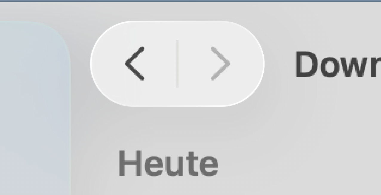
In macOS 27, Apple standardized all window corners to 20 points, down from the 26-point radius introduced last year. The company even highlighted this move toward "consistent corner radii" during WWDC.
I'm not convinced that was the right solution. Consistent? Only within macOS windows. The Dock, Control Center, the new Siri interface, notifications, iPad windows, and even table rows on iOS and iPadOS all continue to use the 26-point radius introduced last year. Toolbar buttons on iPad remain perfectly concentric with their windows, while those on macOS no longer do. In other words, Apple didn't make the overall design language more consistent—it arguably made macOS less consistent with the rest of its platforms.
There's a way back though. Enter defaults write -g NSConvolutionOverride1 -float 26 into the Terminal and everything is perfectly concentric again! This also applies to apps that were not updated for macOS 26 or 27, so some older apps can look a bit broken.
To me, the better solution would have been to keep the larger corner radius and apply it consistently across every window type instead. It almost feels as though Apple listened a little too closely to the internet pundits this time. Those six points of difference simply didn't warrant such a reversal.
iOS
Now let's compare iOS 26 and iOS 27 to see how they stack up.
As you can see, iOS 26 behaves much like macOS. On HDR displays, buttons feature a bright 45-degree highlight rendered using extended white values. Fortunately, most iPhones now ship with OLED displays, making this effect widely available. The iPad lineup is a different story, as only the iPad Pro supports HDR.
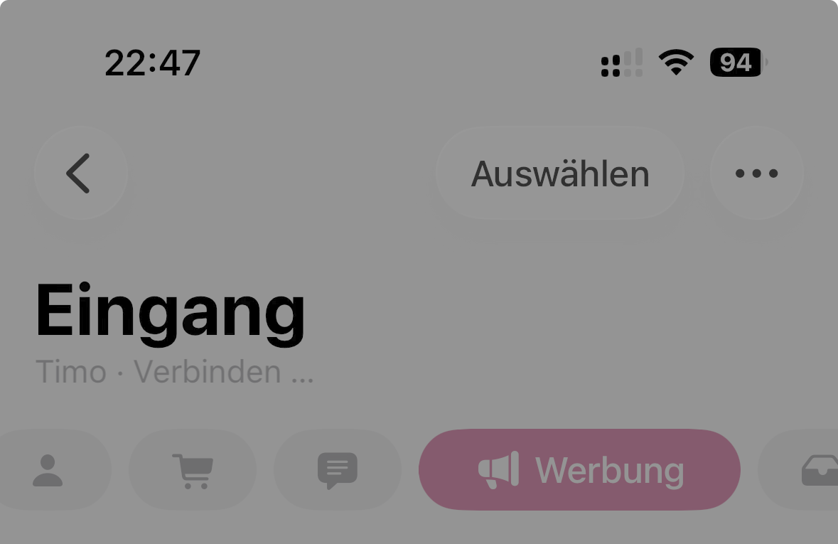
On SDR displays, such as the iPhone SE (2nd and 3rd generation), Liquid Glass suffers from the same issue as it does on macOS. The buttons become little more than white blobs, with large drop shadows serving as the primary way to create a sense of depth.
Now let's see how iOS 27 improves on this.

At first glance, you might think these two screenshots are identical—and you'd be right. That's because iOS and iPadOS 27 actually regressed in this area. Apple removed the HDR highlights entirely, even though they were present in iOS 26.
That decision is difficult to understand. There are far more HDR-capable iPhones and iPads in use than there are HDR-capable Mac displays. As a result, buttons on these platforms now appear much flatter, relying almost entirely on the newly added border strokes for definition. Even the drop shadows are gone.
Well, not entirely. Place a button on a non-white background, and you'll notice that the highlights are still there:
You simply can't see them most of the time because white on white provides no contrast unless HDR is used. As a result, the buttons lack depth and visual separation. They end up looking like flat white shapes outlined with gray borders. At times, the design almost resembles an accessibility mode rather than Apple's flagship visual style.
Dark Mode fares much better. Thanks to the darker backgrounds, the interface no longer relies on HDR alone to create depth, making it feel much closer to the macOS implementation. In Light Mode, however, I think iOS looks genuinely unattractive in its current state.
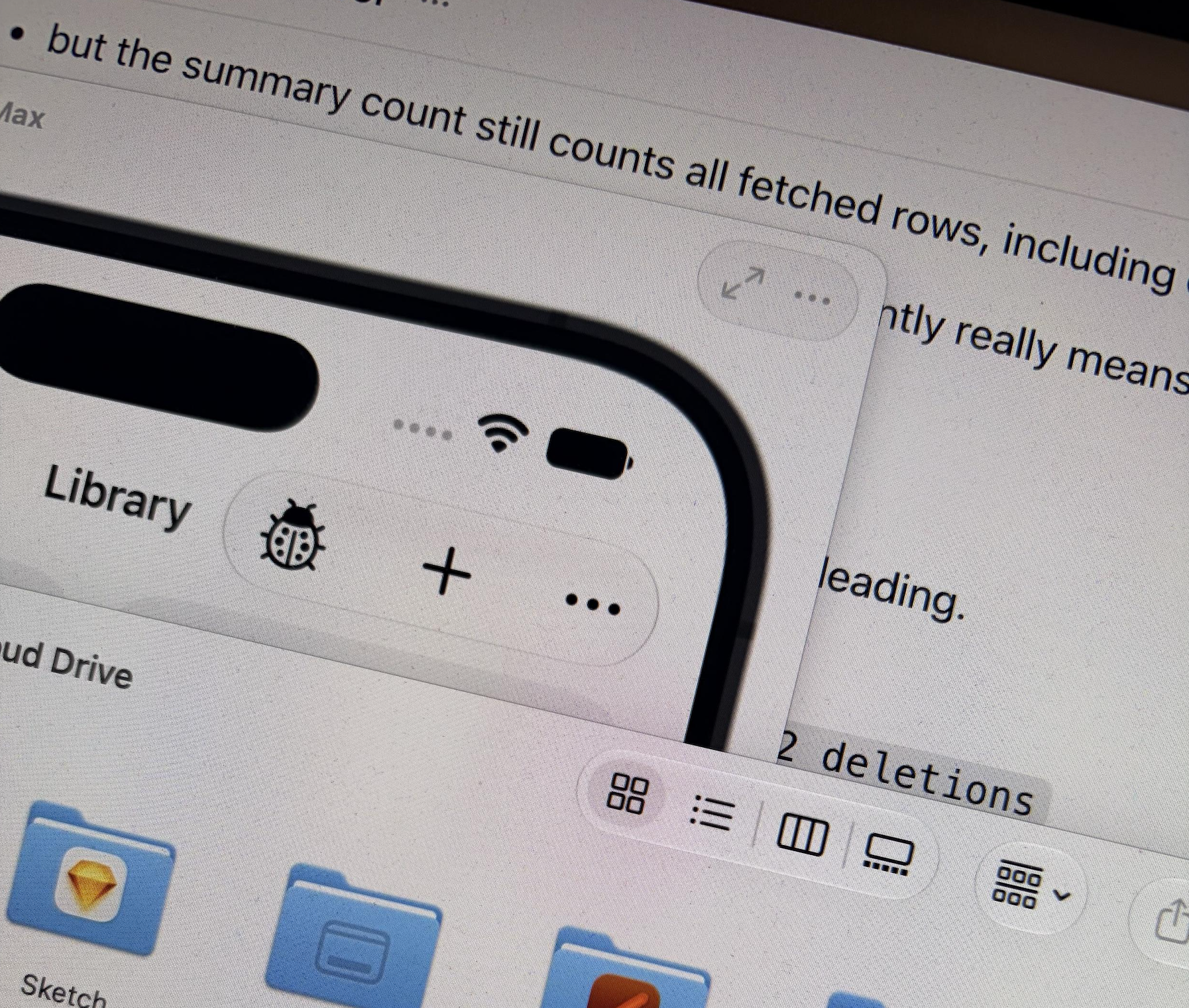
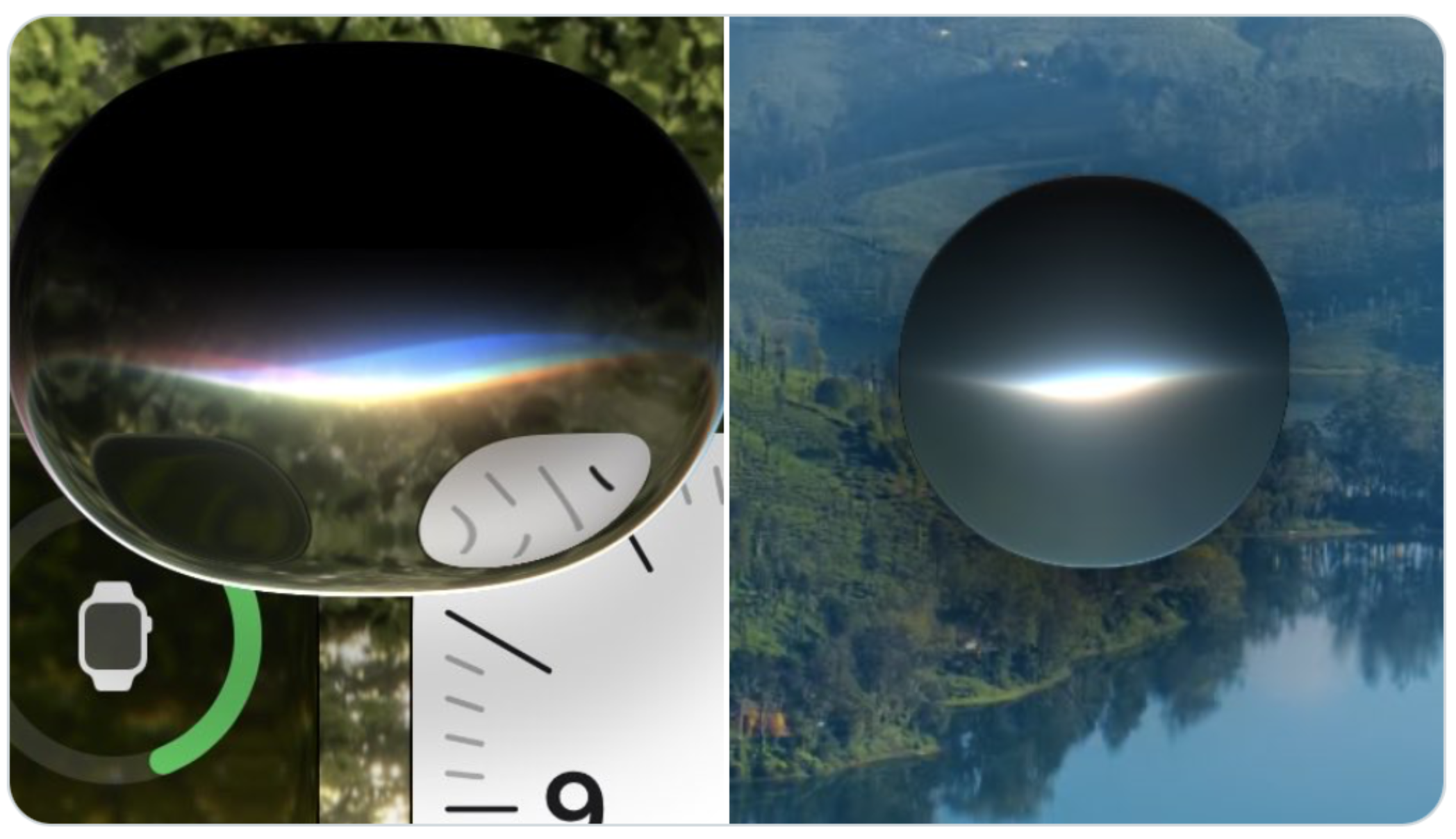
For those without an HDR-capable display, I took the following photo to illustrate the difference. It shows an iOS Simulator window alongside a Mac Finder window, both displaying similar toolbar buttons. The macOS buttons exhibit bright HDR highlights and convincing depth, while the iOS buttons remain completely flat. This is much closer to what the difference looks like in person.
Why remove the HDR treatment?
macOS 26 and iOS 26 both used HDR highlights to give Liquid Glass much of its depth and realism. In macOS 27, Apple refined the effect even further. That raises another question: why do HDR highlights only appear on external HDR displays, such as with OLED and mini-LED, but not on the built-in mini-LED display of the MacBook Pro, which is fully capable of rendering them, and why remove them entirely from iOS this year?
My best guess is battery life. Rendering the glass effect itself is mostly a shader and relatively inexpensive. Continuously driving parts of the display to HDR brightness, on the other hand, consumes noticeably more power. If disabling these HDR effects gains even 20 extra minutes of battery life on an iPhone or MacBook, that may well have been a worthwhile trade-off from Apple's perspective. But if Liquid Glass only looks its best with HDR highlights enabled, then removing them fundamentally compromises the design. HDR is one core pillar of Liquid Glass and it's a paradigm shift in UI design.
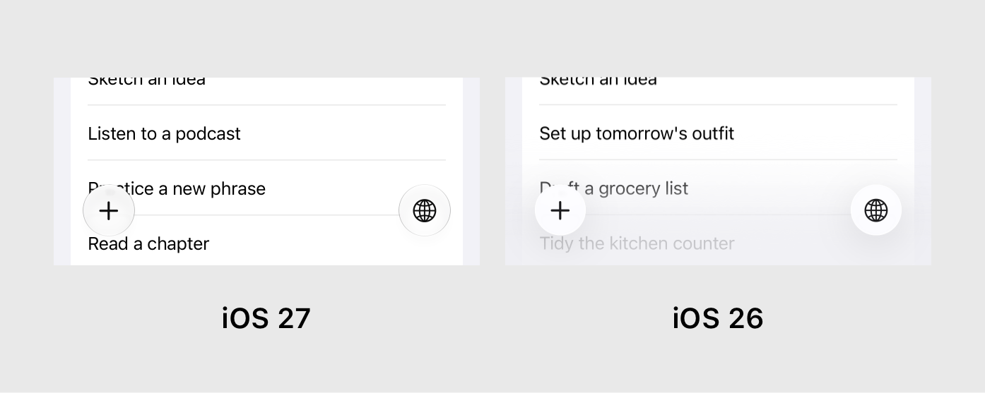
Another change stands out even more. In the first beta of iOS 26, the bottom scroll edge used a progressive blur to help separate toolbars and tab bars from the underlying content. It was the same treatment used beneath navigation bars at the top of the screen. In later betas, Apple replaced that blur with a simple gradient.
Now, in iOS 27, the effect is gone entirely. Toolbars and tab bars sit directly on top of the content. On its own, that wouldn't necessarily be a problem. However, the Liquid Glass material no longer has pronounced shadows or HDR highlights, leaving these controls looking almost completely flat. Compare the two versions below. iOS 26 provided much clearer separation between the content and the actions.
I'm not saying removing the gradient was a bad decision—it always looked a little artificial. The issue is that Apple removed the effect without giving the buttons more physical presence, as it did on macOS. If they had the same sense of depth as the macOS implementation—or even the iOS 26 version—they could naturally separate themselves from the content behind them.
What's especially strange is that Apple removed the bottom scroll edge treatment while doing the exact opposite for navigation bars. The top scroll edge effect is now even more pronounced, making the inconsistency stand out all the more. This is a change that is also on iPadOS and macOS.
Instead of the subtle progressive blur introduced in iOS 26, it is now an almost opaque layer that feels much closer to the navigation bars of the iOS 7–18 era. While this likely improves the legibility of large titles, it often feels overly heavy and makes the available screen space appear smaller—something iOS 26 handled much more elegantly.
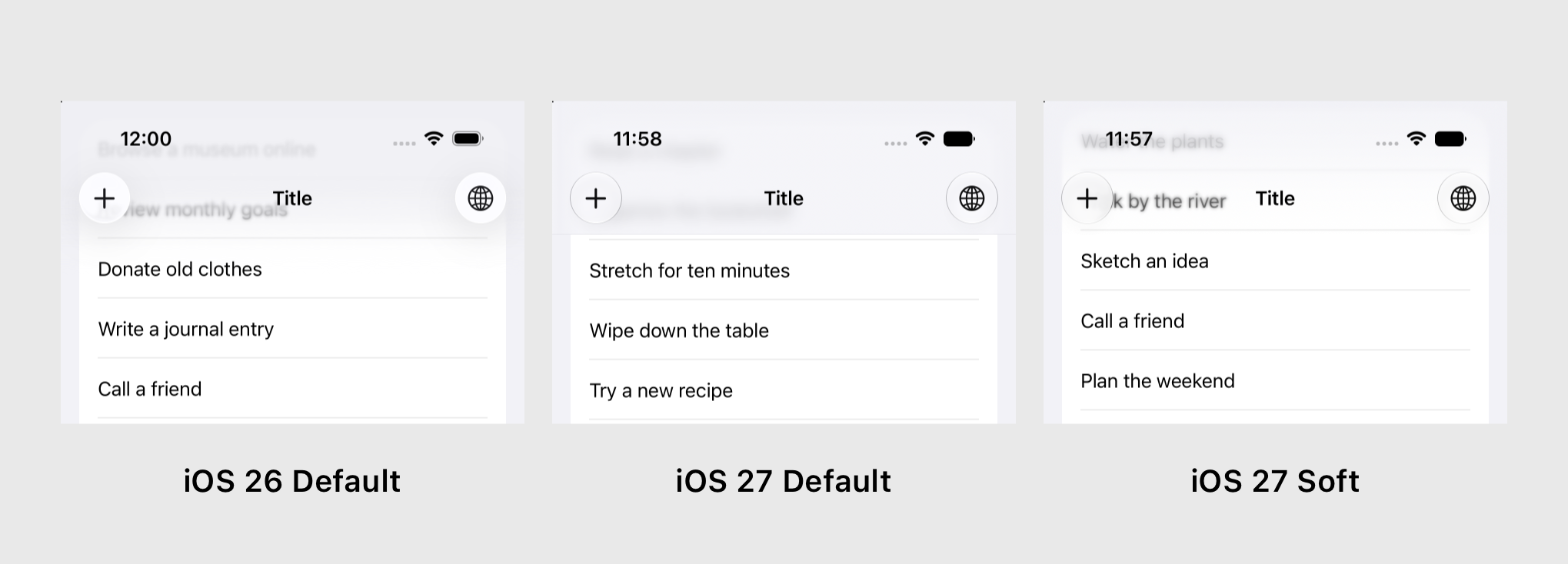
Developers can choose between two scroll edge styles: hard, which is now the default, and soft. In iOS 26, soft was the default appearance. The option still exists, but it has been heavily toned down. Rather than the beautiful progressive blur seen last year, it now looks like an awkward mix of a blur and a gradient that feels unfinished and unrefined.
Curiously, Messages still uses the original progressive blur when a conversation has a custom background, proving that the effect still exists. Third-party developers, however, no longer have access to that appearance.
The change is particularly surprising because progressive blur has been a recurring part of Apple's design language. visionOS introduced it before iOS 26, and watchOS 10 relied on it extensively in its navigation bars. Now Apple has largely abandoned it on iOS and macOS, while continuing to use it on those very same platforms.
tvOS
For some reason, tvOS 27 received none of the Liquid Glass refinements. The materials remain unchanged, the old 45-degree highlights are still there, and it even continues using last year's app icons. It's honestly the strangest outcome of all the platforms this year.
I could almost understand if Apple hadn't had enough time to bring Liquid Glass to tvOS in the first place and had delayed it by a year. But they already shipped the redesign in tvOS 26. So why were there suddenly no resources to implement what are, comparatively speaking, fairly small refinements? It's a bizarre situation.
visionOS
Actually, I may have spoken too soon. An even bigger outlier than tvOS is visionOS. It's now the only Apple platform that still hasn't adopted Liquid Glass at all with the exception of app icons (more on that later). Frosted glass windows and menus remain, but their edge highlights are still rendered at 45 degrees. Only a handful of places—such as the new Siri interface and Messages when a conversation background is enabled—use Liquid Glass buttons. Otherwise, the only place you'll encounter the new material is inside iPad apps running in compatibility mode.
To be clear, I don't think visionOS should replace its frosted glass windows with Liquid Glass. The existing window materials are one of the platform's defining characteristics. But why not apply it to buttons and other controls inside those windows? Those are as flat as ever.
Last year, visionOS also missed several broader design updates, including the more rounded menus, capsule-shaped list rows, elongated toggles, and other refinements introduced across Apple's platforms. This year, most of those elements have finally been updated to more closely match iPadOS. Liquid Glass itself, however, is still missing.
One curious inconsistency remains: if you connect a mouse or trackpad, the cursor is still the circular iPadOS 18 pointer rather than the arrow pointer introduced with iPadOS 26.
watchOS
There's not too much to say here. watchOS largely inherits all the improvements made to Liquid Glass: updated app icons, more defined glass elements, and the new 90-degree highlights. Since most buttons sit on either colored or black backgrounds, the glass effect almost always looks convincing. Apple also made Notification Center readable again by placing the glass notifications on top of a blurred background instead of letting them float directly over the watch face.
My biggest gripe is that parts of watchOS still feel like they're straight out of watchOS 1.0, back when the Apple Watch had a square display. Many buttons don't use the capsule shapes that have become a defining part of Apple's design language since watchOS 10 and iOS 26. Even the toggle control shape doesn't match the latest aesthetics just introduced last year on the other platforms.
Icon Composer 2
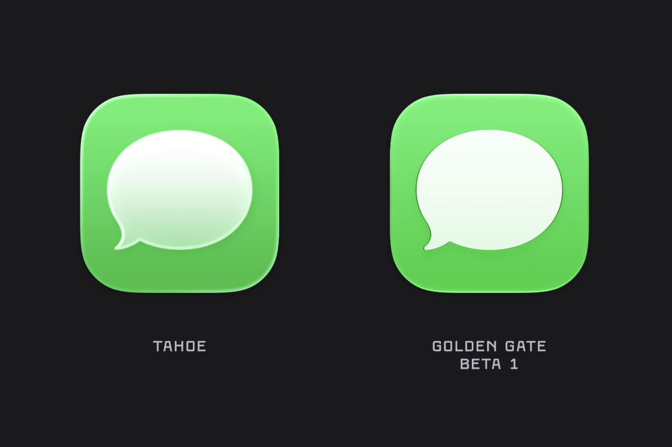
Icon Composer launched last year to help developers create Liquid Glass app icons. This year, Apple improved it with more realistic refractions and sharper specular highlights. While it's still not perfect, the 2027 release produces noticeably better-looking icons in many cases.
One of my biggest gripes is that many icons now look too sharp, if that makes sense. The dark outlines make them feel overly defined, especially at smaller sizes. On the iPad in particular, they appear noticeably aliased on its 2× Retina display. They fare better on the iPhone's 3× displays, but some icons have become so flat that they almost resemble the iOS 7 design era again.
More detailed and complex icons are definitely an improvement, but the simpler "white glyph on a gradient" icons have lost much of their depth. Their sharp edges and lack of shadows make them appear flat, whereas the softer, more translucent look in iOS 26 felt more convincing and visually appealing.
You can learn more about the changes to app icons in this excellent blog post from Parakeet. Unfortunately, Icon Composer still can't generate app icons for visionOS or tvOS. Why? For the second year in a row, only Apple has access to the official workflow. I raised this issue twice during the Icon Composer group session at WWDC, but both questions were dismissed. For app icons that heavily rely on Liquid Glass in their icons, like my own, it would be hard to translate them to a flat icon for other platforms. Developers have no choice but to recreate the Liquid Glass effects themselves if they want consistent branding across every Apple platform.
A small bit of self-promotion: the icon for my app Gamery benefits significantly from the new rendering style. With a few adjustments, it now looks much crisper than it did in iOS 26, and finally resembles actual pieces of glass rather than plastic.
Everything else
Remember last year's discussion about app icons and buttons appearing crooked because of the 45-degree edge highlights? That particular issue has been solved by the new 90-degree highlights. However, a new one has taken its place. On certain backgrounds, elements can now appear clipped at the top and bottom because the edge highlights blend into the surrounding content. Reintroducing a subtle shadow around the buttons would likely solve this problem.

When Liquid Glass debuted, Apple's Human Interface Guidelines and WWDC sessions made one thing very clear: glass should never be placed on top of another glass surface. As a result, controls inside sidebars and smaller sheets often fell back to flat surfaces or shapeless buttons. In the 2027 releases, Apple has quietly reversed course. Glass-on-glass compositions are now not only supported but actively encouraged.
As has often been the case over the years, macOS still doesn't feel quite as polished as Apple's other platforms when it comes to interface details and animation quality. Much of that is probably a consequence of AppKit and the challenge of modernizing such a mature framework while preserving compatibility.
Two examples stand out this year: the new Siri interface and Liquid Glass physics. Both attempt to match the experience on iOS, but neither quite reaches the same level of polish. The animations feel less fluid, the transitions less refined, and the overall presentation lacks some of the effortless quality found on Apple's touch-based platforms.
macOS does adopt some of Liquid Glass's physical behavior this year, including subtle click animations and springy, bouncy interactions. One major piece is still missing, though: the fluid morphing between button shapes and interface elements that gives iOS much of its distinctive character.
Conclusion
Overall, Apple's 2027 design updates are a mixed bag. macOS benefits enormously from the refinements to Liquid Glass and now delivers the most convincing implementation of the material across Apple's platforms. watchOS also moves in the right direction, while iOS and iPadOS surprisingly lose much of the depth that made Liquid Glass feel truly physical. tvOS and visionOS, meanwhile, remain strangely inconsistent with the rest of Apple's ecosystem.
Many of these changes will likely continue to evolve throughout the beta cycle, and some may even be intentional trade-offs for readability or performance. Still, I hope Apple restores some of the depth and visual richness that made the original Liquid Glass concept so compelling. The foundation is stronger than ever—now it just needs to be applied consistently.
Thanks to Timo for some of the iOS screenshots!